
Redesigning Clickexams to boost user engagement.
In India, Tutors and their after-school tuition classes are the backbone of the education system and students' understanding. Clickexams was developed to help students practice for standardised tests in India during the Covid pandemic. I redesigned the platform, increasing tutor collaborations and engagement within a year.
Platform: Exam Practice Portal
Timeline: Dec '20- July '22
Role: UX/UI Designer, Testing

01. THE PROBLEM
1. User interface and experience issues.
2. Low client engagement
3. Non-responsive design.
03. THE SOLUTION
1. Conduct User Research and Market Analysis
2. Simplify the user flow for better navigation
3. Bring uniformity to the user interface design.
02. THE GOAL
1. Help students and tutors practice during a strict Covid lockdown.
2. Address current user experience issues.
3. Expand client base.
04. THE OUTCOME
1. Clients associated: 6 -> 82 within a year.
2. Better navigation and accessibility.
3. Increased engagement from tutors and students.
The Problem.
The Issues.
1. User Interface and User Experience Issues: No hierarchy. No uniform design system. Dated design. Clashing elements.
2. Undefined Userflow: The users (clients, teachers and students) found it difficult to navigate through the website
3. Low Client Engagement: The combination of the below UX and UI issues caused low engagement, and no new users showed interest in joining the platform.


How did I do it?
The Process.
The three major steps involved identifying the problem with the website, restructuring it, and redesigning the entire website. I presented the prototype to my client and then to the tutors to help them better understand the new user flow.

User Research
What did the clients have to say?
I launched a survey that was targeted towards the current clients and students using the website. This provided us with the users' perspective.
TEST: Use the website to schedule, solve an exam and reach the results section.
Research Method: Quantitative
Approach: Survey
Participants: Teachers and students
Sample: Small


Wireframes
Wireframes
Before finalizing the wireframes, I designed around 30+ wireframes to discuss the best and simplest ways of designing screens. I designed around 25+ wireframes for the finalized designs for this website.
"Keep it Simple, Stupid" - KISS principle
We agreed that the best approach with UI design would be following the Minimalistic Approach.
Before finalizing the wireframes, I designed around 30+ wireframes to discuss the best and simplest ways of designing screens. I designed around 25+ wireframes for the finalized designs for this website.
"Keep it Simple, Stupid" - KISS principle
We agreed that the best approach with UI design would be following the Minimalistic Approach.


Important Features
Enhancing student experience.
In the final design, I integrated the important features that were absent in the original website. My priority was to make the website as functional as possible.
Mobile-First & Responsive Design
As per the very first point of discussion, the most important page on the website is the exam screen. A responsive exam screen would help students anywhere (urban and rural areas) in the state access the exam.


The Result.
What was achieved.
1. User Impact during a Pandemic: With the whole world standing still in 2020, including the education system, bringing the tutors and students online and creating a website that was easy to navigate and colour-coded was one way to ensure that their practice wasn't an added stress during already highly uncertain times.
2. Tutors increased from 6 to 82: After redesigning the platform, the business saw exponential growth in engagement from tutors and students using the portal.
3. Clear design hierarchy and easy navigation: The simplified and colour-coded examination screen, and responsive design along with a clear user flow.
4. Increased engagement: The number of students and teachers associated with the platform increased exponentially, further resulting in growth ot the business.
5. Balance between users and stakeholders achieved: By focusing on both the user needs and conducting the necessary user research, it helped in boosting the business, in turn fulfilling the stakeholders' expectations.
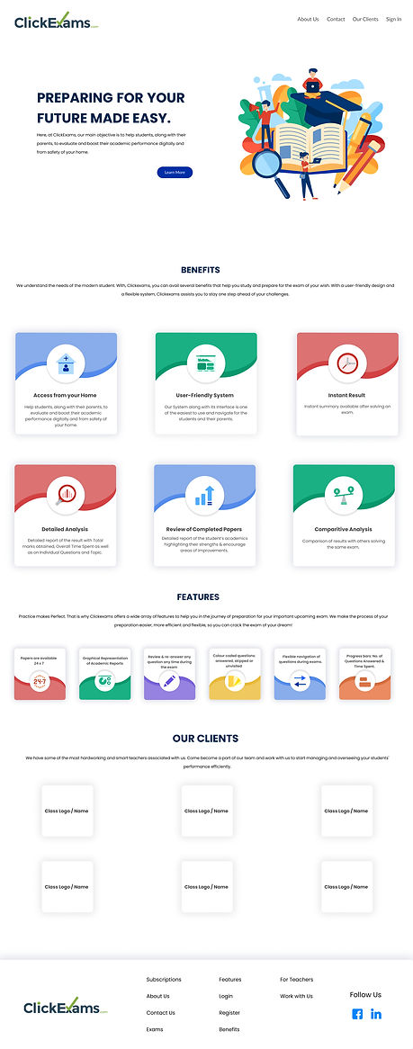
Final UI Design
The final UI Design improves on the various aspects of the old website. The bright colours are replaced with pastel colours, UI principles and structure.




What would I do differently?
Scope of improvement
- To counter further user experience issues, I should have conducted separate research when onboarding newer tutors and students. That could have ensured that the new platform was working efficiently. It would also have given me a much larger sample of participants to survey, thereby exposing any further issues, both in experience and interface.
- I should have added a colour blind version, especially on the 'Exam Screen ', and used a monochromatic colour palette where possible.