THE PROBLEM
The client's business completely depended on the website which was plagued by several user experience and interface issues, leading to inability to expand it further. The current teachers associated with the platform reported various usability problems that prevented them from using the website.
THE GOAL
My aim was to address their client engagement challenges. The business had been set up for 6 months, with stagnant engagement. I worked closely with a small team including 2 Developers, 1 Designer, 1 Project Manager and 1 Stakeholder as a UX/UI Designer to solve these issues.
THE SOLUTON
I sat down with my client's team to formulate a three- step solution. This three-step solution included User Research, followed by Restructuring the user flow & lastly UI Redesign.
THE PROCESS
Three major steps involved identifying the problem of the website, followed by restructuring, and lastly redesigning the entire website. I presented the prototype to my client and then to all of their 6 clients to help them better understand the new user flow.

Who is it For?
The designs were meant to be catered towards the teachers and students.


User Research
I launched a survey that was targeted towards the current clients and students using the website. This provided us with the user's perspective.
TEST: Use the website to schedule, solve an exam and reach the results section.
Research Method: Quantitative
Approach: Survey
Participants: Teachers and students
Sample: Small


Website Issues
After recieving and analyzing the results of the user research. Lack of User Research, Accessibility and a Dated UI Design has led users to click OFF the website.
CAUSE - 1
Clashing Design Elements
The original website contained several clashing overwhelming elements. It also had a high level of legibility issues. Also, the website was not responsive.
CAUSE 2
Weak Website Structure
The structure of the website and the navigation system was not thought out properly. The absence of a landing page confused the initial clients.
CAUSE-3
Unclear Hierarchy & Uniformity
The website lacked a clear hierarchy of different UI elements and text. It also suffered from spacing, legibility issues and a dated design.
Design Observation: Original Website


Redesign Ideation
Restructure:
I restructured the entire user flow to avoid any confusion that the users were facing during their test.
"Do not make think" - Steve Krug
We aimed to keep the user flow of the website simple and functional.

Wireframes
Before finalizing the wireframes, I designed around 30+ wireframes to discuss the best and simplest ways of designing screens. I designed around 25+ wireframes for the finalized designs for this website.
"Keep it Simple, Stupid" - KISS principle
We agreed that the best approach with UI design would be following the Minimalistic Approach.
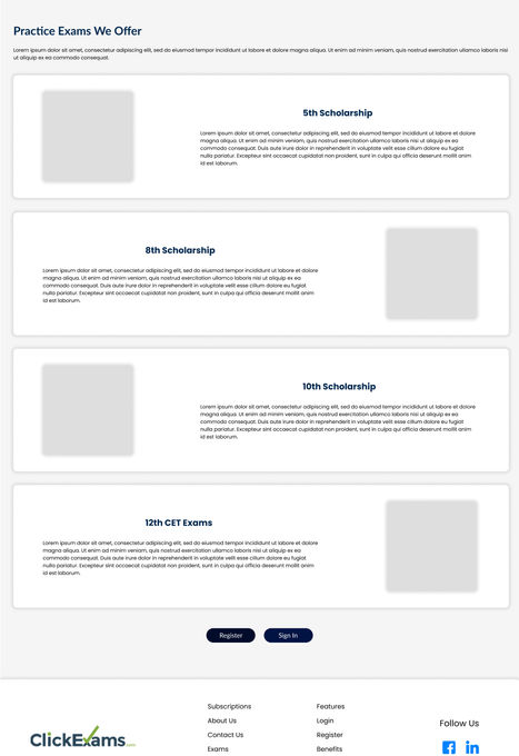
Final UI Design
The final UI Design improves on the various aspects of the old website. The bright colours are replaced with pastel colours, improved on the heirarchy and structure.


